|
|
Post by MidgardDragon on Aug 24, 2008 15:20:04 GMT -5
Heh, same thing I came here to do.   |
|
|
|
Post by Callandor on Aug 24, 2008 22:10:22 GMT -5
Ummm.. whats with the dvdactive thing? |
|
|
|
Post by MovieMan8877445 on Aug 24, 2008 22:23:23 GMT -5
On The Last Page, It's An Actual Link To The DVDActive Page.
|
|
|
|
Post by Callandor on Aug 25, 2008 0:21:31 GMT -5
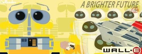
O ok, hmm I'm still not seeing any box art...
|
|
|
|
Post by smkndofpnutdssrt on Aug 25, 2008 1:54:47 GMT -5
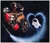
I don't think the cover art is that bad. True, it doesn't do Wall-E justice and it's a little too kiddish, but it's not bad.
But of course, if I had any say in the matter, I would have really liked to see it have the image of Wall-E standing on a pile of trash looking up at the stars. If you know which one I'm talking about. You probably do.
|
|
|
|
Post by Bubblegum on Aug 25, 2008 2:20:32 GMT -5
I would have really liked to see it have the image of Wall-E standing on a pile of trash looking up at the stars. If you know which one I'm talking about. You probably do. I agree completely. That's such a poetic shot. |
|
|
|
Post by MidgardDragon on Aug 25, 2008 6:32:59 GMT -5
Yes, I love the blue starry night sky with WALL-E looking up at it. I would love to see that with the white and red WALL-E logo at the top, and nothing else on the box.
|
|
|
|
Post by vanessajoyce on Aug 25, 2008 8:09:03 GMT -5
Yes . . . the starry sky one would be my choice too. But not dramatic enough for North Americans?
Also, I wonder if it's been compared to the "Short Circuit" poster too much and Disney just would rather not go there.
Too bad, whatever the reason. It's the most gorgeous promo poster I've seen for the film.
|
|
|
|
Post by MidgardDragon on Aug 25, 2008 8:12:05 GMT -5
Sadly, it is probably simply that they thought it was too "simple" for the USA. I dunno about you, but I think the current version is too "busy" for anywhere.
|
|
|
|
Post by vanessajoyce on Aug 25, 2008 8:24:52 GMT -5
Yes, I want to be kind here . . . but this version is kind of . . . how to I put this? . . . "juvenile"? Just doesn't have the respect for the film that I would have hoped. I mean, at least get the context of the shot correct. (Like someone said earlier, "what's M-O holding on to?)
But, I don't want to get all wrapped up (no pun intended) in the cover because it's what's inside that matters. Since we're getting tons of extras, I don't want to be a complainer.
|
|
|
|
Post by MidgardDragon on Aug 25, 2008 8:32:29 GMT -5
Yep, they definitely went all out on the inside of the DVD. It is still sad that the outside implies some kiddie film, though.
|
|
|
|
Post by vanessajoyce on Aug 25, 2008 12:56:12 GMT -5
Hear, hear. Just reinforcing the stereotype.  |
|
|
|
Post by Viva la Vida on Aug 26, 2008 18:03:37 GMT -5
Yeah, it's not exactly a bad cover, but it's obvious that the Disney marketing folks were more concerned with clumping together most of the key characters and concepts(WALL-E, EVE, M-O, the Earth and the plant) without any regard for plausibility.
|
|
|
|
Post by bima on Aug 29, 2008 7:39:27 GMT -5
Why do I smell DISNEY on this cover design? Well, cannot blame them though... Wall-E sure will be put on a KID section with another disney princess and sing a long songs (a very dark thought, though).
Why don't they made two version of the cover? Just like Harry Potter books. One for the kids, another one is for adults!
|
|
|
|
Post by vanessajoyce on Aug 29, 2008 7:43:26 GMT -5
Wow, what a fantastic idea! THAT would have been very cool.
|
|


 Thanks to fastdash9 for the avvy!